Creating a platform where community challenges fuel motivation.
Loop’s Fitness Mission
Loop helps users stay active by making fitness social and goal oriented. It seeks to encourage friendly competition through community-driven challenges.
Why I Was Brought In
After losing one of their designers, Loop lacked clear direction and UX consistency. I joined three weeks into the timeline and stepped in as design lead to bring focus and structure.
Because I joined the project late, I began by creating a revised timeline to ensure we could make our Demo Day deadline. I set clear design deadlines, ensuring our team stayed ahead and that the developers would have enough time to implement each round of designs.

Define
• Competitive Analysis
• Timeline Restructuring
• Context Review

Design
• Lo-fi Development
• Mid-fi Development
• Feasbility Reviews

Deliver
• Hi-fi Development
• Motion Prototyping
• Interaction Design
Because I joined the project late, I first adjusted the timeline to make sure we could meet our deadline. I decided to skip full user research and instead did a brief competitive analysis of our top competitor.
Focus Areas
• Competitive Analysis
• Timeline Restructuring
• Context Review
I first started by mapping user flows and defining key interactions. Working with the tech leads’ initial list of potential features, I helped assess which were contextually relevant and necessary, establishing a foundation for the product.
We selected the SF Pro typeface, using both SF Pro and SF Pro Display to streamline development.
Why this font?
• Native to SwiftUI
• Faster implementation
• Apple's official font (iOS Club)

We decided to center our app around a bold, monochromatic red. Secondary and tertiary reds were applied to establish heirarchy and call attention to key actions.
Our wireframes were designed using the iPhone 14 dimensions. Top-safe-area margins were omitted because the demo day device wasn’t confirmed at this stage.


After establishing a solid framework and design system, I moved on to developing wireframes. Each wireframe went through multiple iterations and reviews to ensure an intuitive user experience.
Focus Areas
• Low-fi Development
• Mid-fi Development
• Feasibility Reviews
I started by creating lofis, producing two variations per screen to evaluate layout and content hierarchy. I also took over two unassigned screens to support the team.
After revision with my design team and tech leads, I decided to move forwards with the selected screens for their ease of use.


The mid-fidelity wireframes focused on refining layout and UI elements. After confirming the demo day device, I developed and implemented top safe area margins.


With the user flows finalized, I transitioned to high-fidelity prototyping and interactive wireframes to help drive implementation and maintain a unified direction for our project.
Focus Areas
• Hi-fi Development
• Motion Prototyping
• Interaction Design
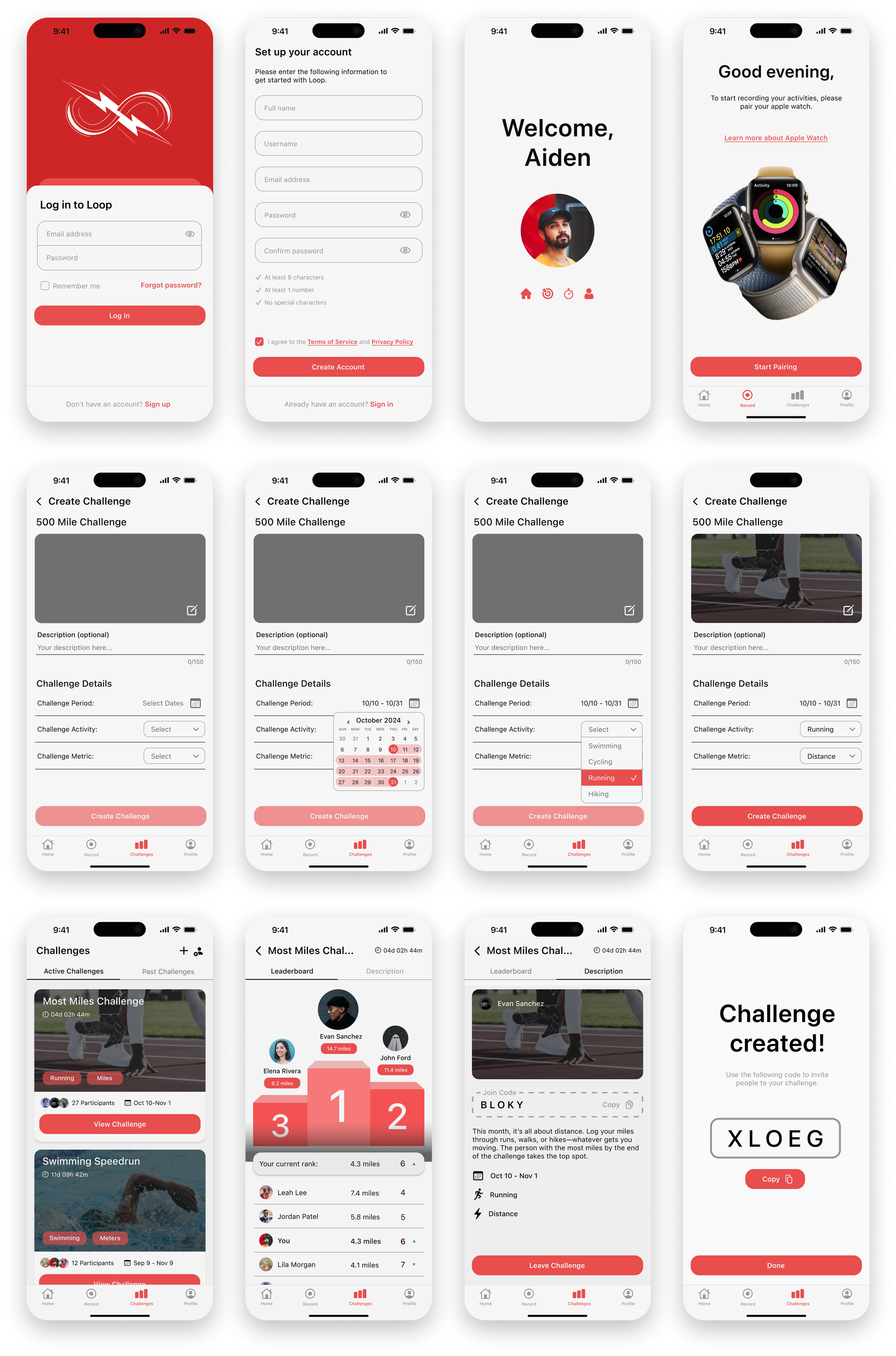
Login and sign up screens provide a streamlined entry experience, guiding users into the app.
Users can personalize each challenge by setting the name, date range, activity, and metric, as well as an optional description. They can also choose a custom image or use the app's presets.
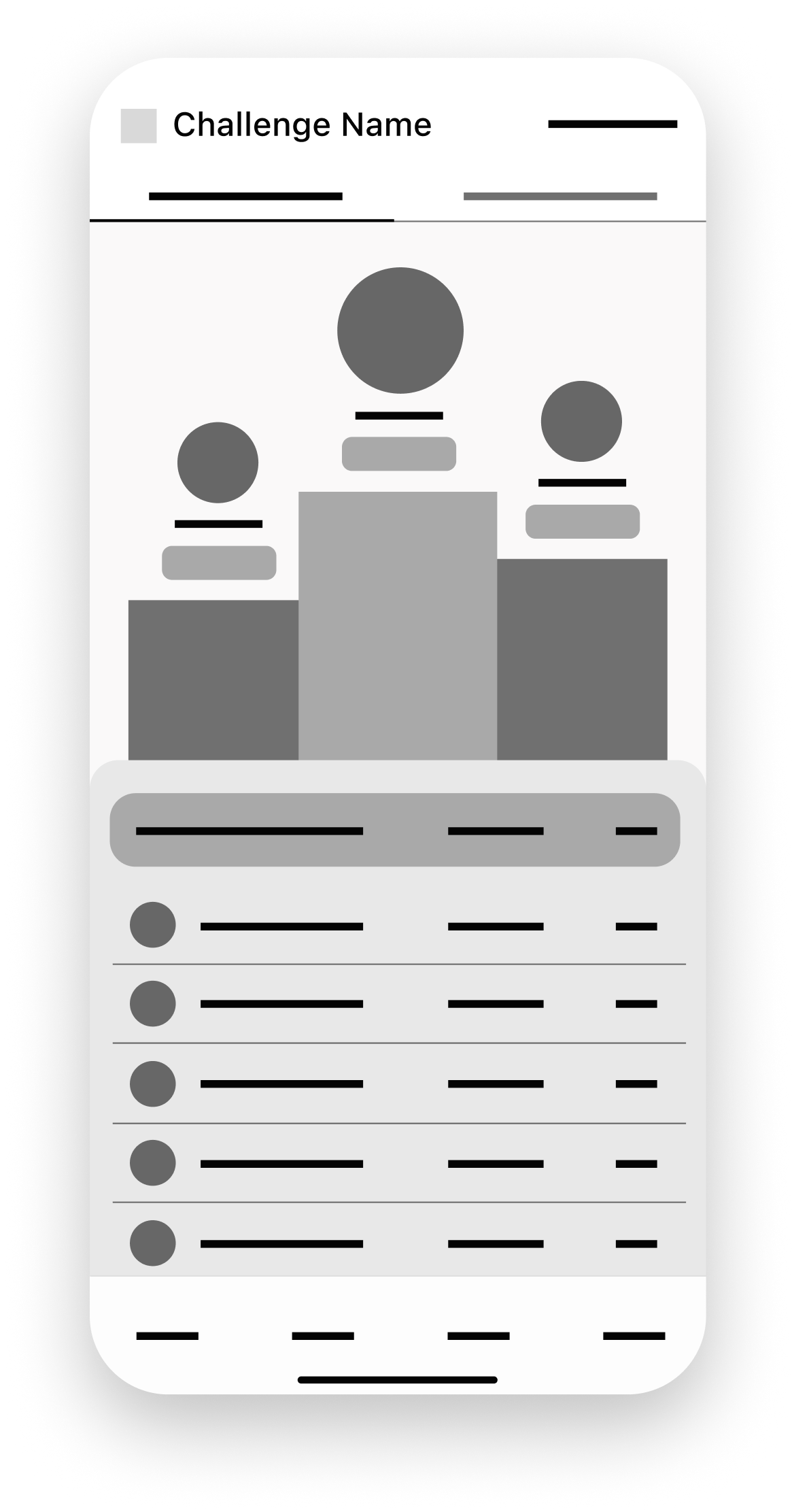
Users can track live progress with the Challenge tab, which displays live rankings and stats through an interactive leaderboard. They can also review challenge details and access the join code for easy sharing.
A splashpage of all the final wireframes I created for different tabs in Loop.